Gaia
Mobile App
Optimization
OVERVIEW
Gaia is a video-streaming service that offers the largest resource of consciousness-expanding videos. Content is divided into three main categories – Yoga, Transformation, and Seeking Truth. As part of a grad school project, Gaia approached our student cohort for assistance optimizing their mobile app experience. Our team worked with Gaia team members to design features for members and non-members with the goal of increasing daily use and average time spent on the mobile app. Our team specifically focused on “Seeking Truth” users.
DISCOVER
Competitor Research
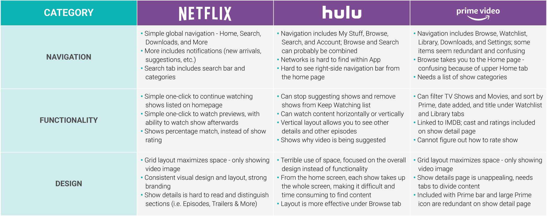
As a video streaming service Gaia’s competitors include Netflix, Hulu, and Amazon Prime. Our team performed a deep dive analysis on each app to understand best practices and identify opportunities for improvement. Our team also researched other consciousness-expanding platforms, including Collective Evolution, High Existence and Spirit Science to understand “Seeking Truth” users.
COMPETITIVE ANALYSIS CHART
Heuristic Analysis
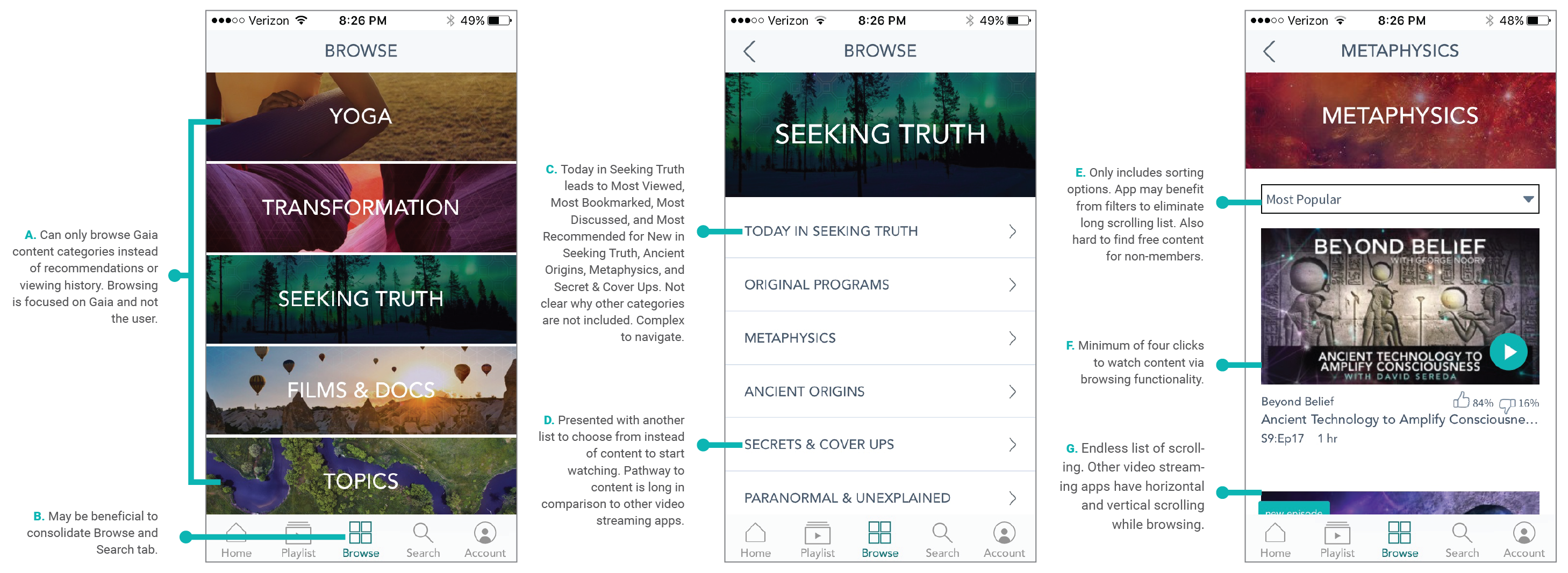
After analyzing competitors’ apps and products, our team performed a heuristic analysis of the Gaia mobile app to assess usability components, including information architecture, navigation, and functionality. We also looked at app reviews online.
ANNOTATED CURRENT SCREENS
Usability Testing
Gaia already has fully-fledged user personas. To understand how “Seeking Truth” users view the Gaia app, each team member conducted informal usability testing with a participant that reflected the “Seeking Truth” persona. We asked each participant to browse content, watch a video, and create a playlist over the course of a weekend. Afterwards, we interviewed each participant to determine what they liked and disliked about the app.
PARTICIPANT QUOTES

RESEARCH INSIGHTS
DEFINE
Overall Strategy
Based on our research and project brief, we developed a comprehensive strategy that optimizes the way users find, watch, and engage content. We introduced two new features for each area. In addition, we developed a notification strategy designed to enhance the new features. Our team also outlined what features would be different for members and non-members.
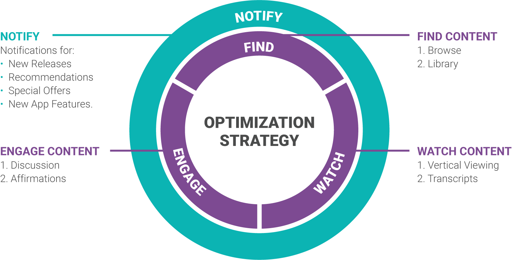
FIND CONTENT
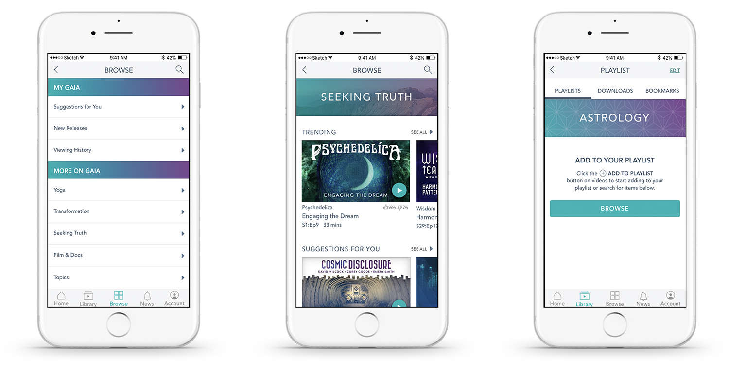
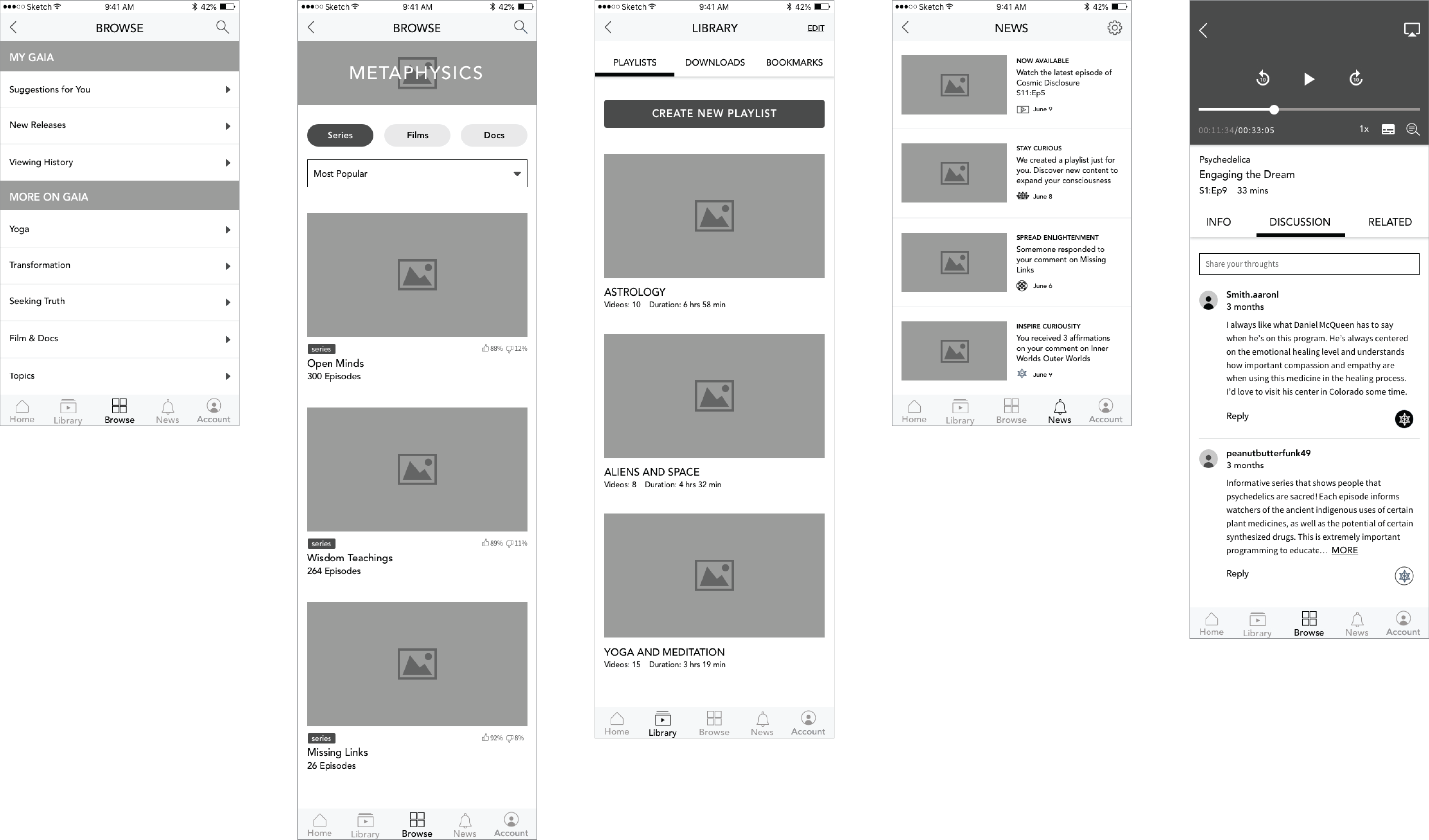
To simplify pathways to content, we redesigned the Browse tab to enable users to find content they want to watch in two clicks as opposed to four. We also introduced filters to allows users to sort content by series, films, and documentaries. In addition, we added a Library tab to allow users to access their playlists, downloads, and bookmarks all in one place. Users can create more than one playlist now.

Watch Content
Similar to other video streaming platforms, we created a vertical viewing option. We also added a three-tab menu to maximize space for episode information, discussion, and related content. In addition, we added a transcript button to the video player that brings up live audio transcripts. Members are able respond, share, and save snippets from videos.

Engage Content
We created a Discussion tab to allow users to scroll through and write comments when watching videos. We also created an affirmations buttons, so users can ‘like’ comments.

Notify
We added a News tab to the global navigation where members and non-members can access notifications for new content, recommendations, new offers, and new app features.

DESIGN
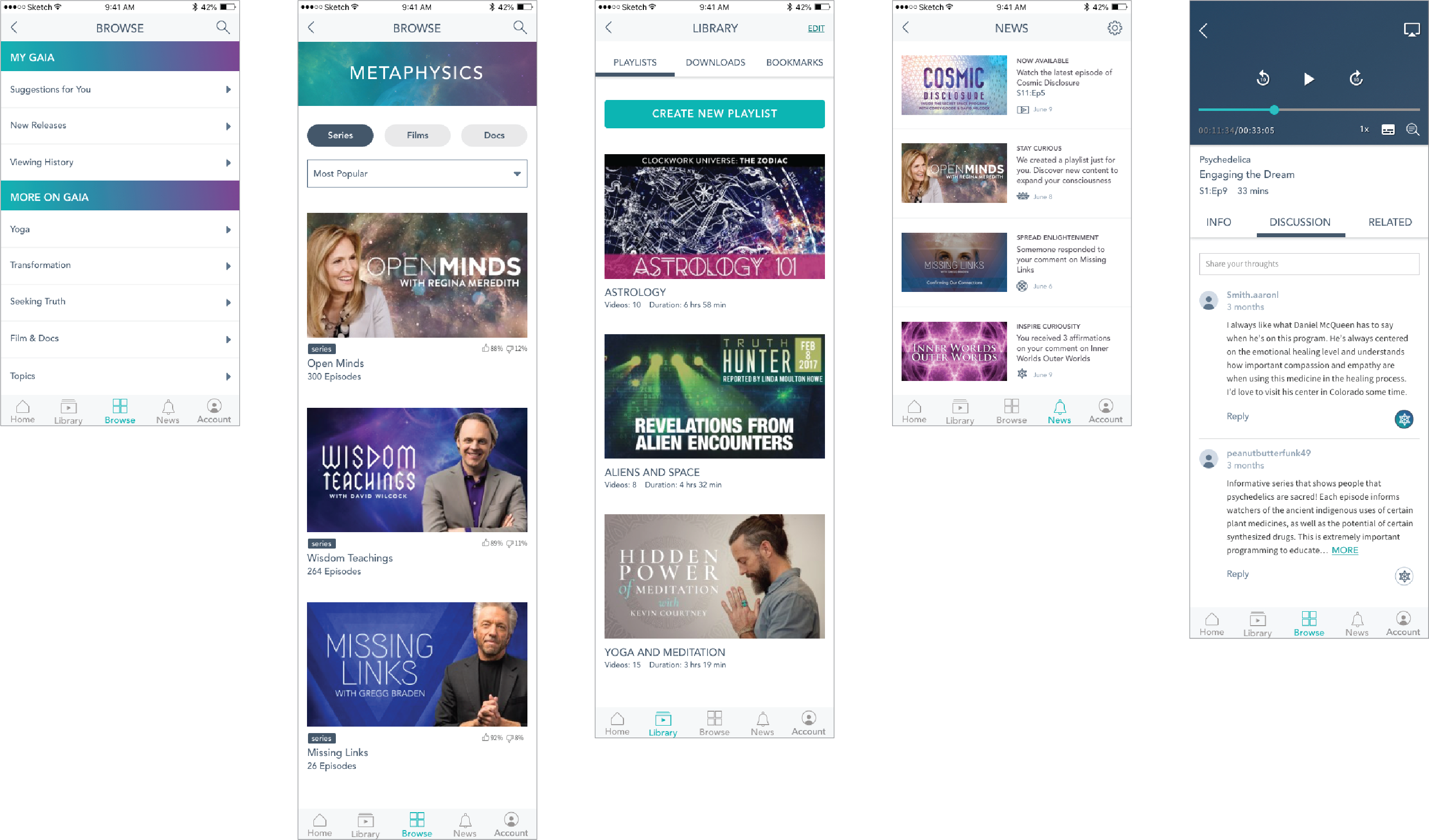
As Co-UI Lead, I worked with another student to design 40+ screens, adhering to Gaia’s brand guidelines. I was responsible for compiling our screens and doing the final QA, while she designed our animated prototypes to show the client during our pitch.
WIREFRAMES
AFTER
REFINE & DELIVER
Our team had the opportunity to present our new app features to the Gaia team. Our strategy and overall design were well-received. We submitted our design and Sketch files to the Associate Creative Director for future design considerations.
