Headspace App
Accessibility
Design
OVERVIEW
With over one million people in the world experiencing some form of disability, it is our responsibility as designers to remove barriers and create more inclusive user experiences. As part of a grad school project, we were tasked with redesigning a mobile app to be accessible for an assigned disability. Over the course of a semester, my team and I integrated accessibility at every stage of the UX/UI design process to optimize the Headspace app for colorblind users.
DISCOVER
What is Colorblindness?
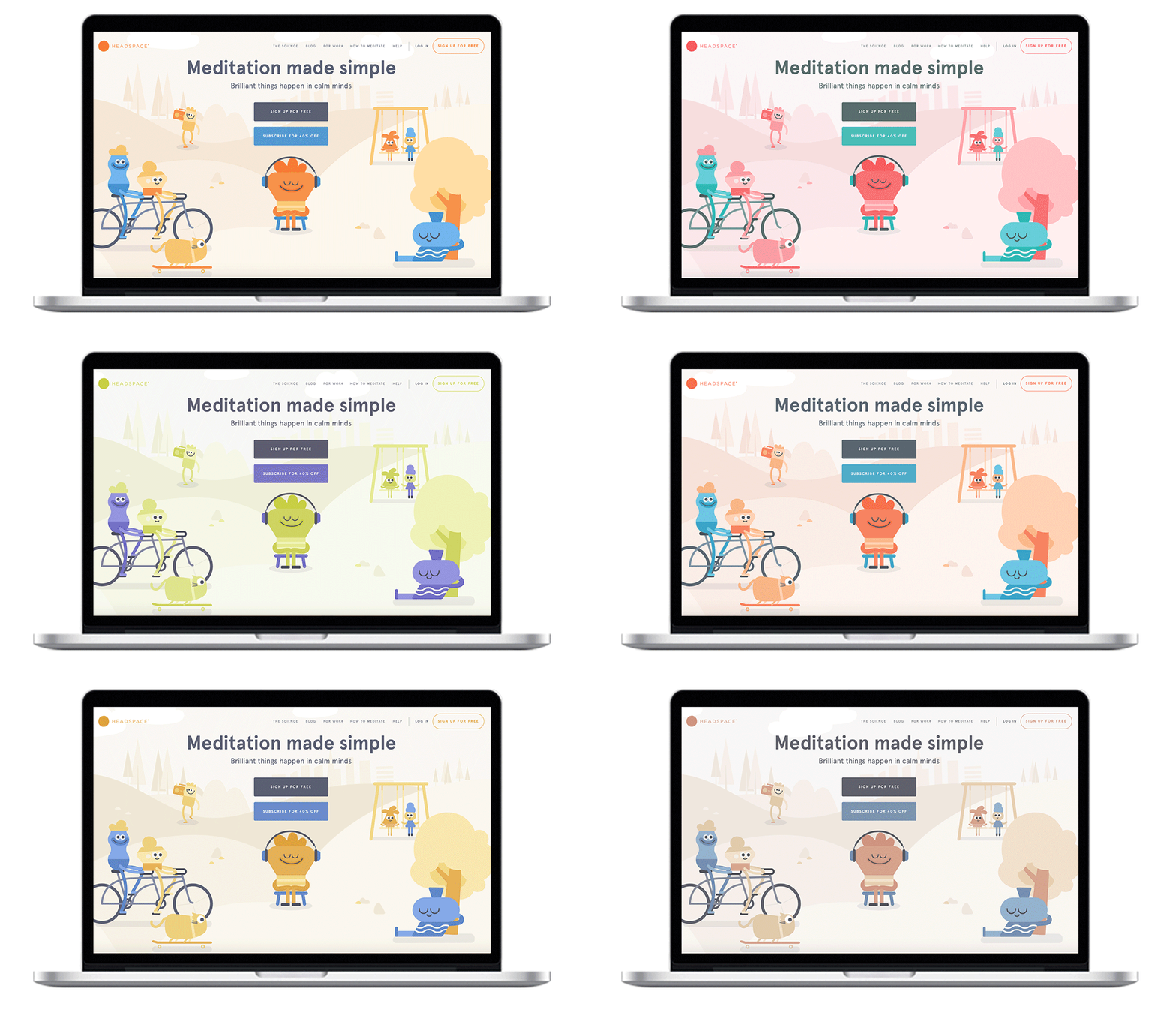
As part of our initial research, we wanted to understand color blindness. Simply put, color blindness is a reduced ability to distinguish between certain colors. There are eight types of color blindness, with red-green color blindness being the most common. To discover how colorblind people see the world, our team used a variety of assistive technologies, including Color Blind Pal and Colorblinding.
Content Assessment
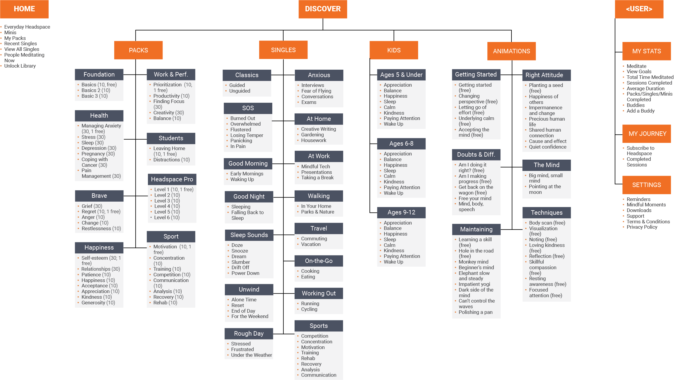
Headspace has a subscription-based business model that offers monthly, annual, and lifetime plans. Headspace provides free access to a limited number of meditation sessions with the goal of converting users to a paid subscription plan. I performed an initial content assessment to explore the free and locked content and the app’s information architecture. From this initial assessment, we discovered that Headspace had an extensive library of meditation sessions; however, it is extremely difficult to navigate and filter through. In addition, we saw an opportunity to introduce personalized content to convert users to a paid subscription plan.
INFORMATION ARCHITECTURE
User Research
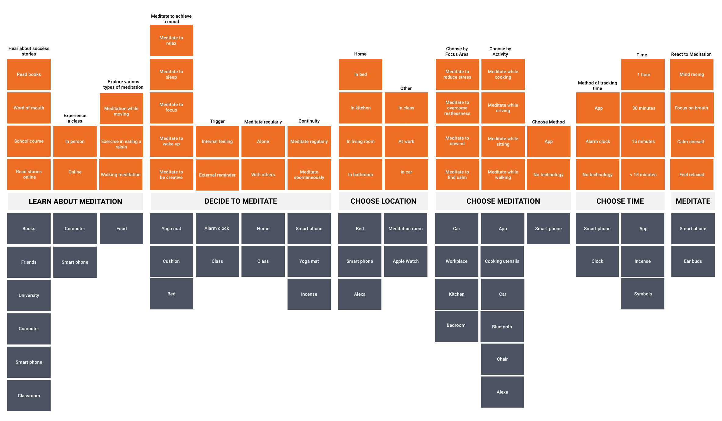
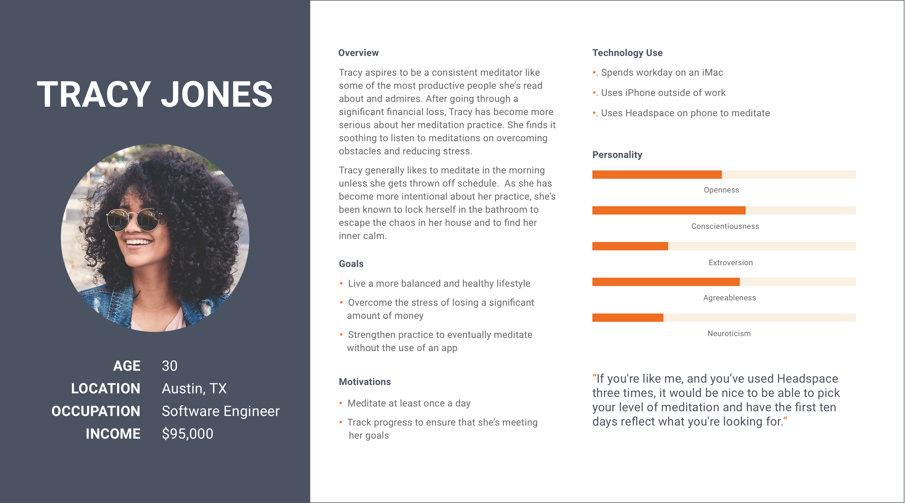
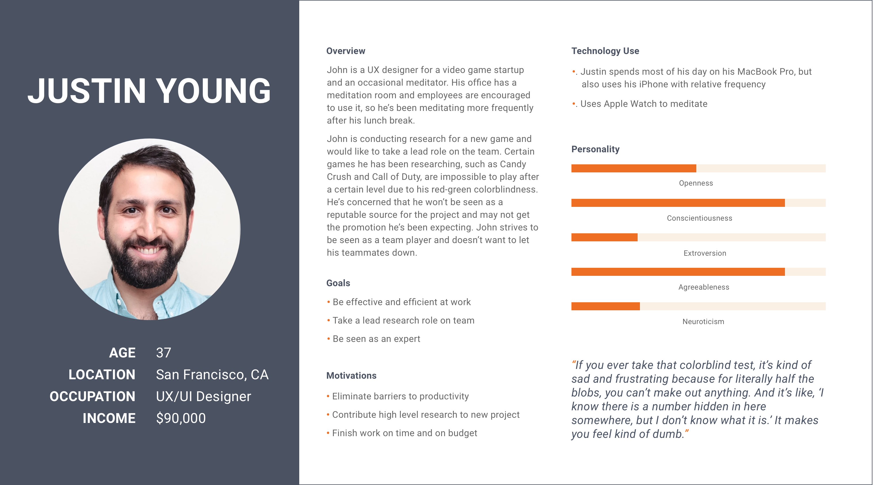
Our team conducted 12 interviews with users. We interviewed colorblind users to better understand their pain-points and technology use. We also interviewed a wide range of meditators to understand the process of meditating, including the activities, environments, interactions, objects, and users (AEIOU). Our team followed a diligent interview process that included completing interview postcards and debrief sheets for each participant. After conducting the interviews, our team built a comprehensive mental model diagram that illustrated the reasoning, reactions, and guiding principles that pass-through users’ minds as they meditate. In addition, we built representative user personas to help guide our design process.
MENTAL MODEL
USER PERSONAS
RESEARCH INSIGHTS
DEFINE
Mobile Accessibility
A key objective was optimizing the user experience for colorblind users, while still reflecting the unique Headspace brand. In our research, a majority of colorblind users did not seek out assistive technologies. Based on this key insight, we decided to strategically optimize the user experience by allowing users to select their own color scheme and character. Using this approach, colorblind users are able to select a mobile experience optimized for their specific type of colorblindness, without being advertised as an assistive technology. In addition, we decided to redesign the mobile app to meet at least W3C WCAG Level AA compliance leveraging Headspace’s existing color scheme. I conducted a detailed compliance assessment to document compliance issues.
COMPLIANCE CHART
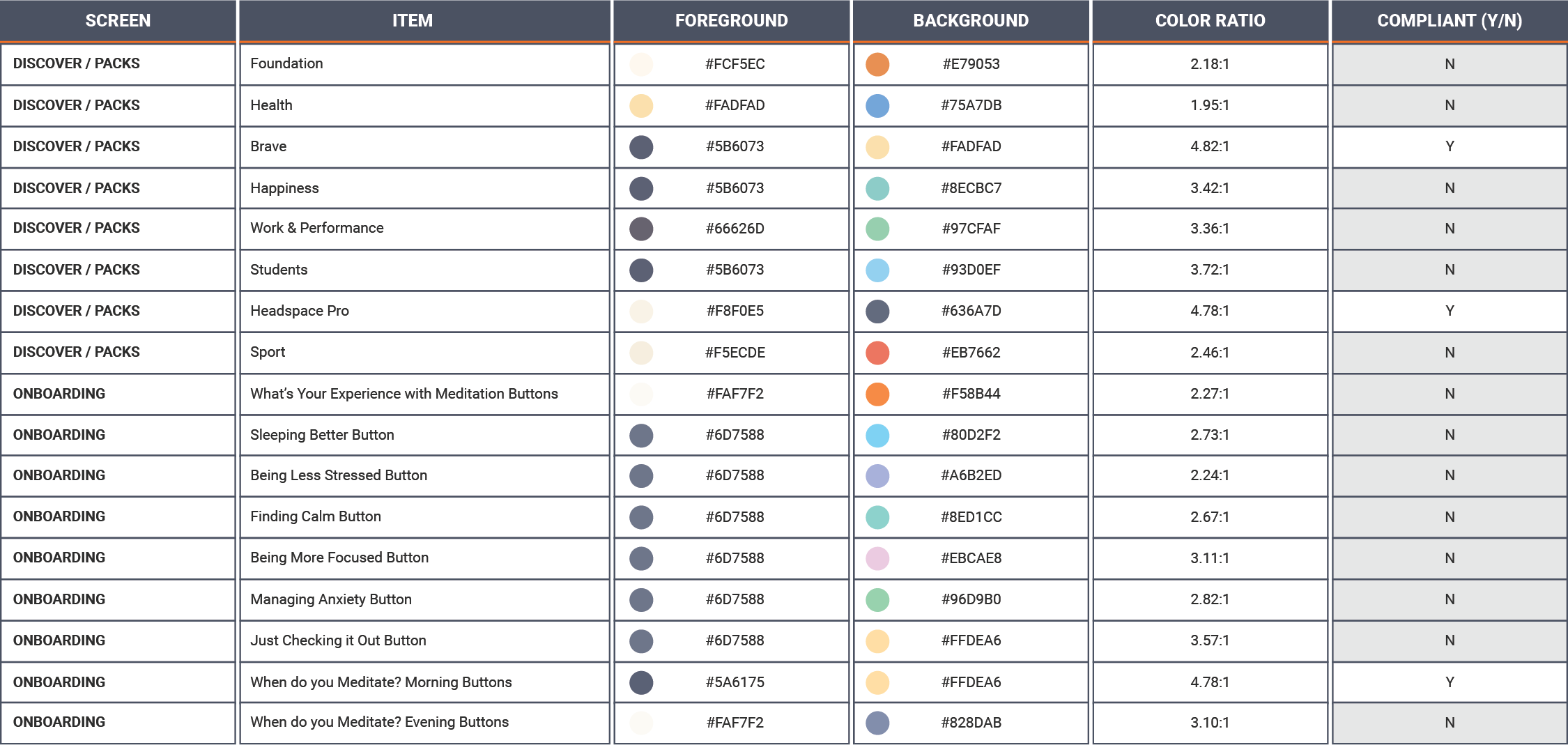
COMPLIANCE CHART

Personalization
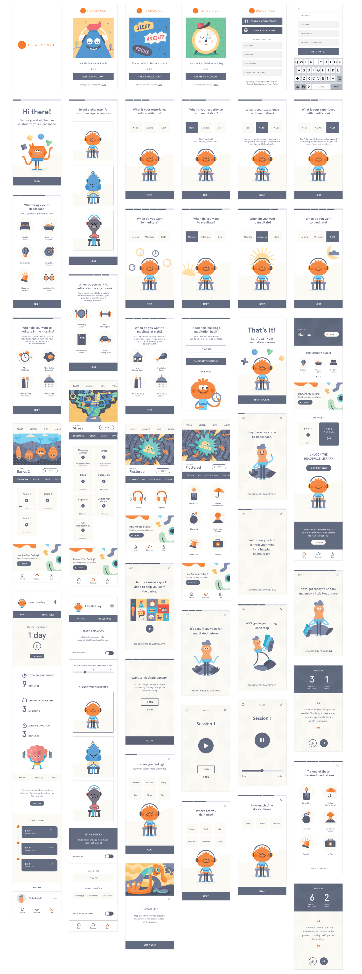
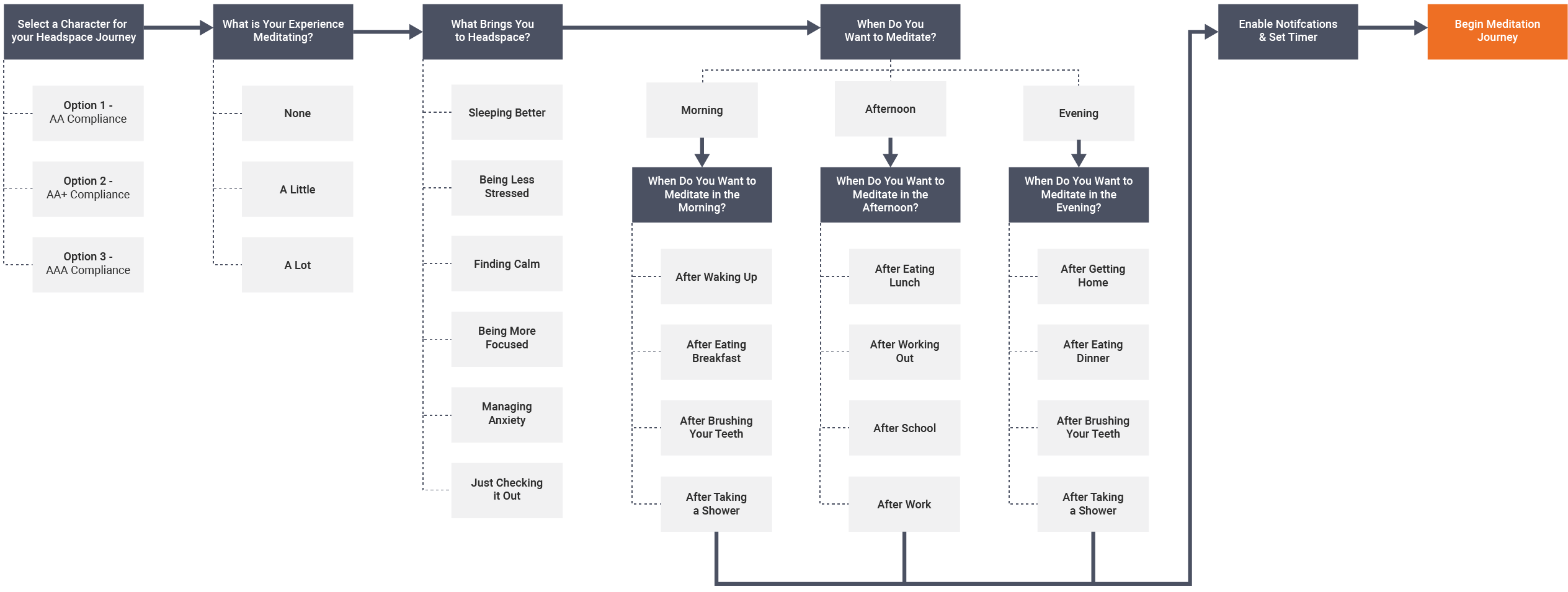
Our team sought to create a unique and personalized user experience that encourages users to upgrade to a paid monthly, annual, or lifetime subscription plan. In order to do this, we redesigned the mobile onboarding process to gather and leverage user data to deliver relevant content.
ONBOARDING PROCESS
Navigation Optimization
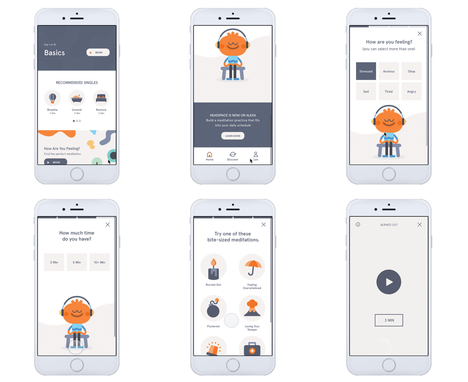
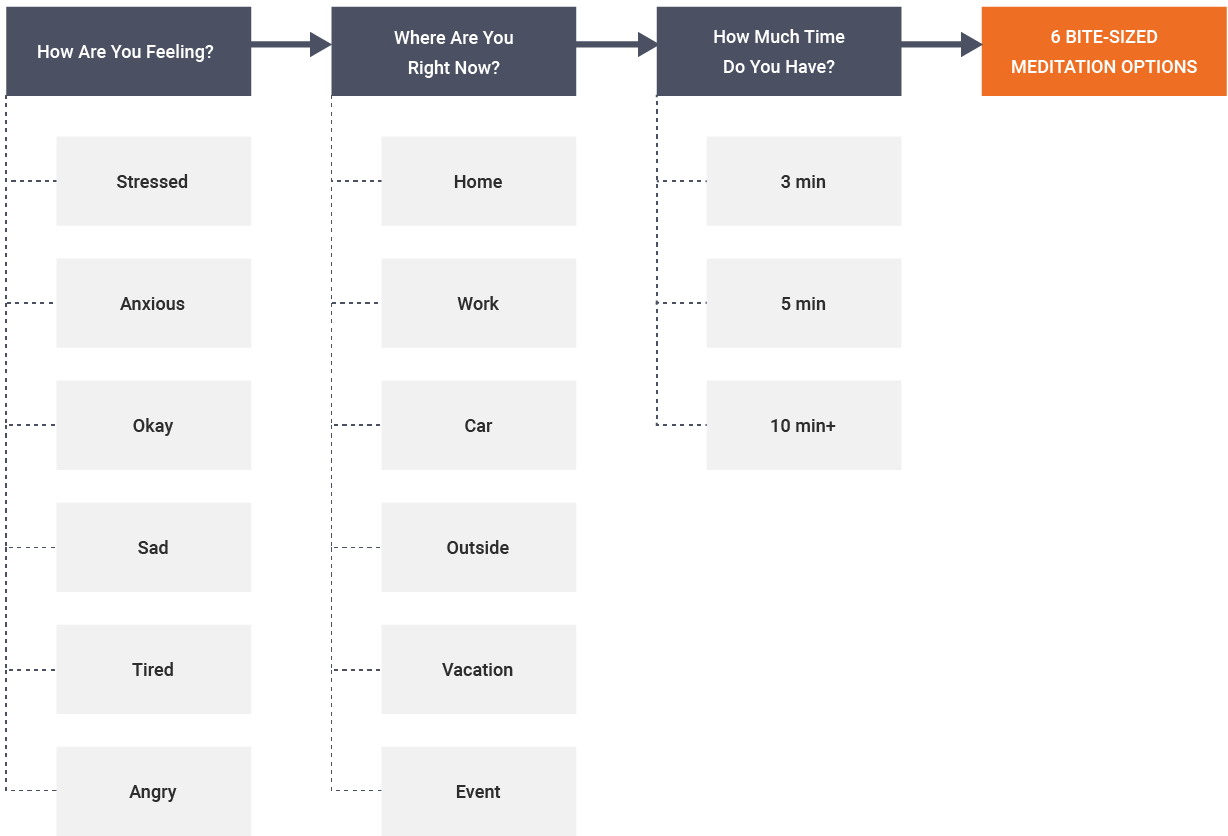
As part of the redesign, we wanted to enable users to navigate the app more efficiently and find relevant content quicker. In order to accomplish this, our team incorporated a “How are you Feeling?” feature to allow users to find the perfect meditation.
“HOW ARE YOU FEELING PROCESS”
DESIGN
Mobile Accessibility
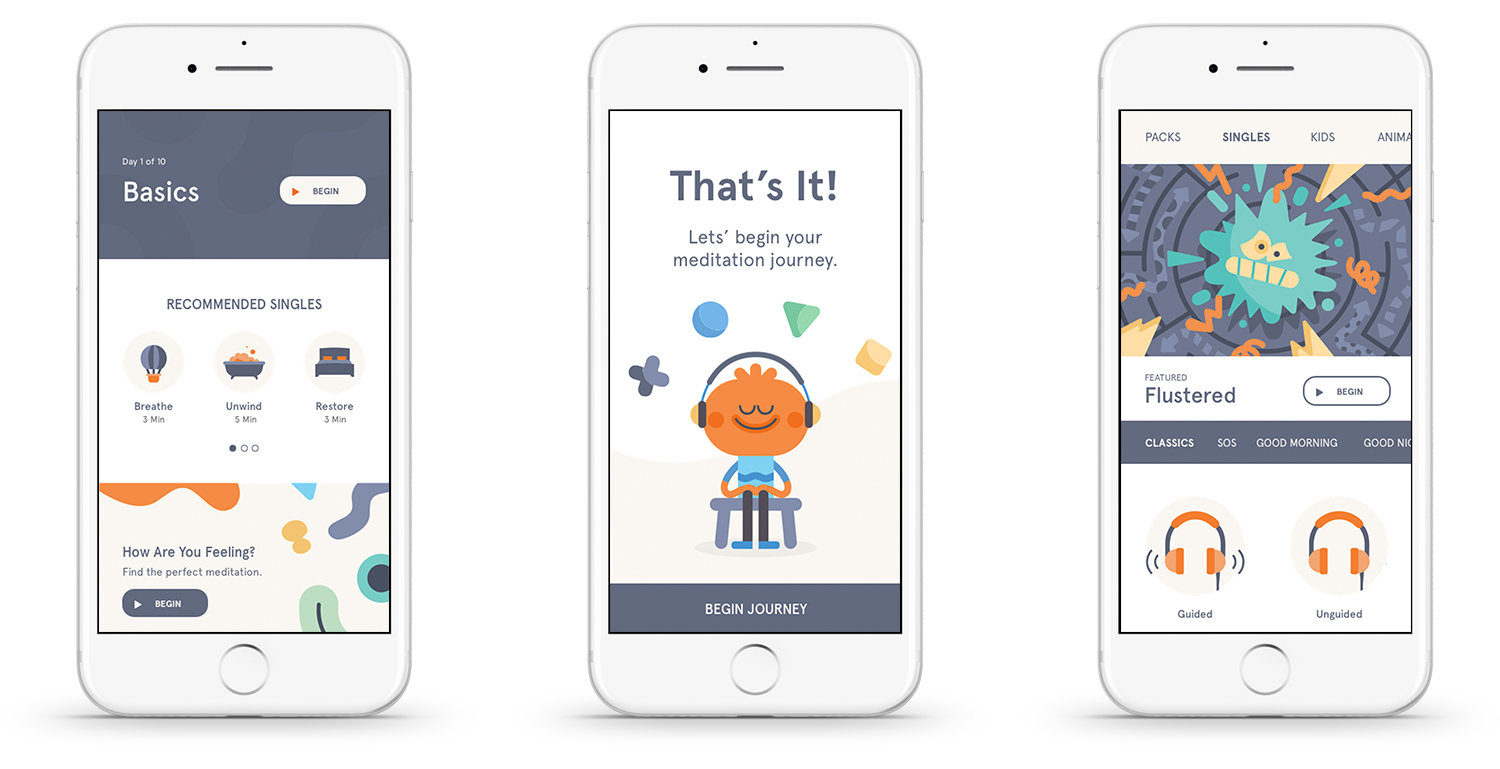
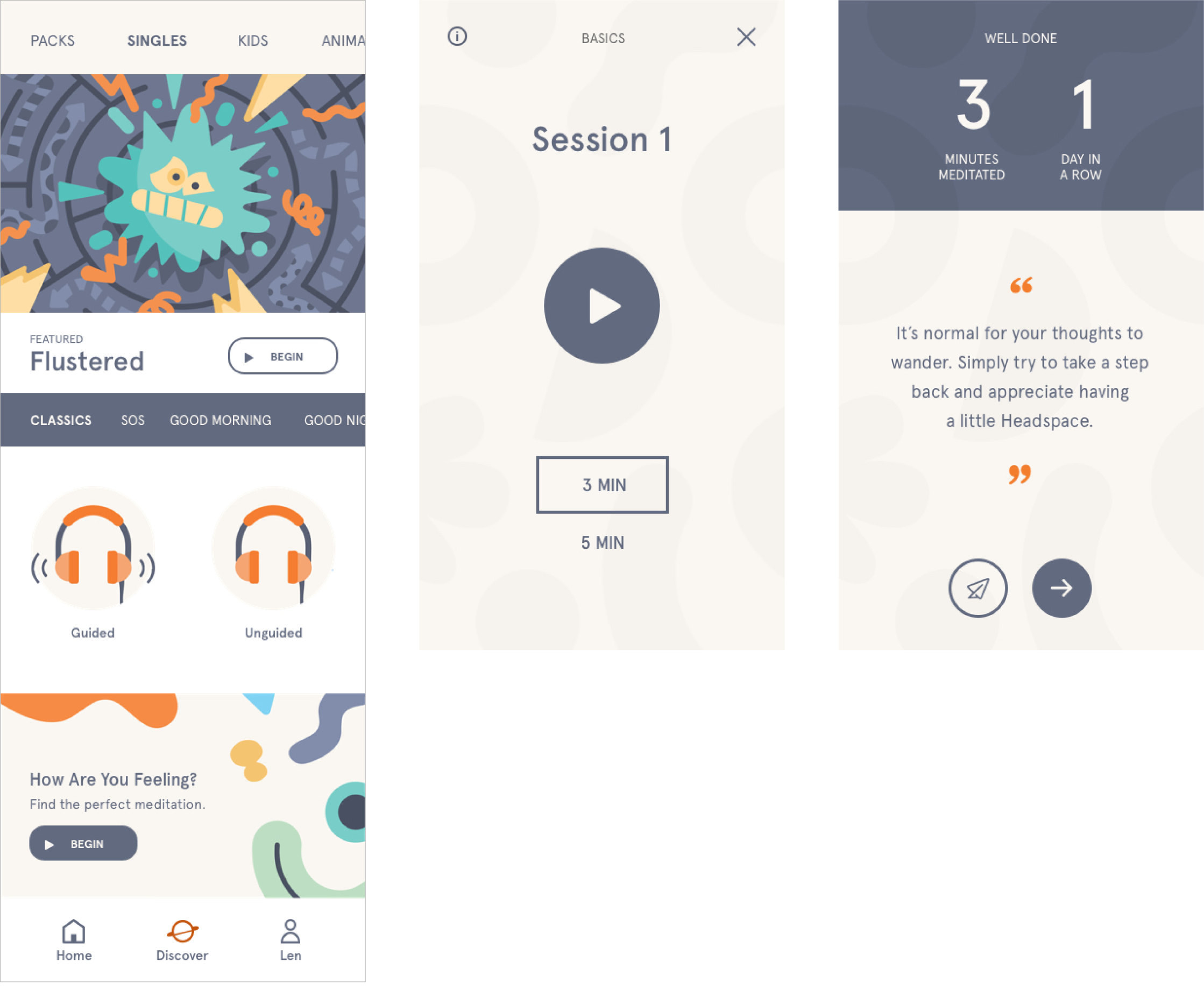
Headspace has a strong brand identity that includes vibrant colors, charming characters, and lively animations. However, a majority of their mobile app is non-compliant. In order to meet accessibility requirements, yet still reflect Headspace’s branding, I leveraged the existing color scheme and changed the way colors were combined and used together to create more color contrast.
BEFORE (NON-COMPLIANT)
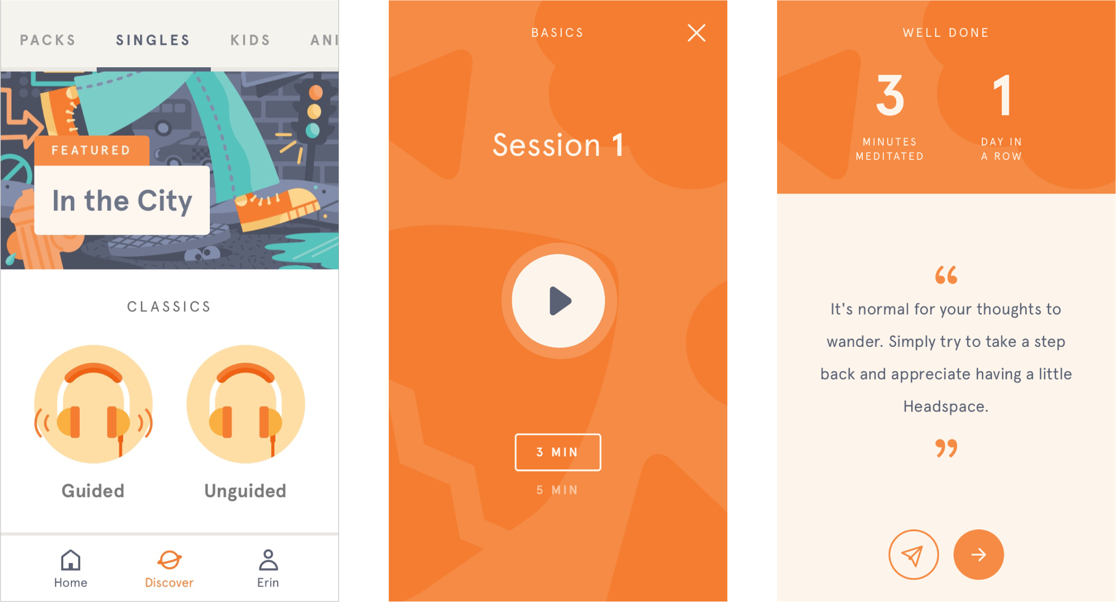
AFTER (COMPLIANT)
Personalization
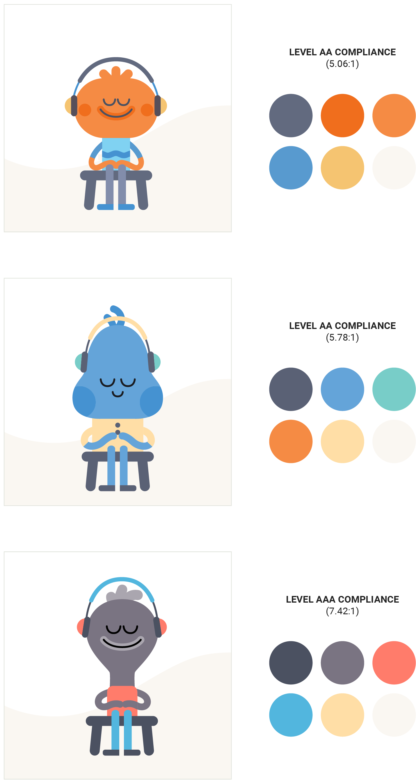
In order to create an optimized user experience for colorblind users, I designed three different characters for users to choose from during the onboarding process. Each character has a different color scheme with increasing levels of color contrast between the lightest and darkest color.
ONBOARDING CHARACTERS & COLORS
Navigation Optimization
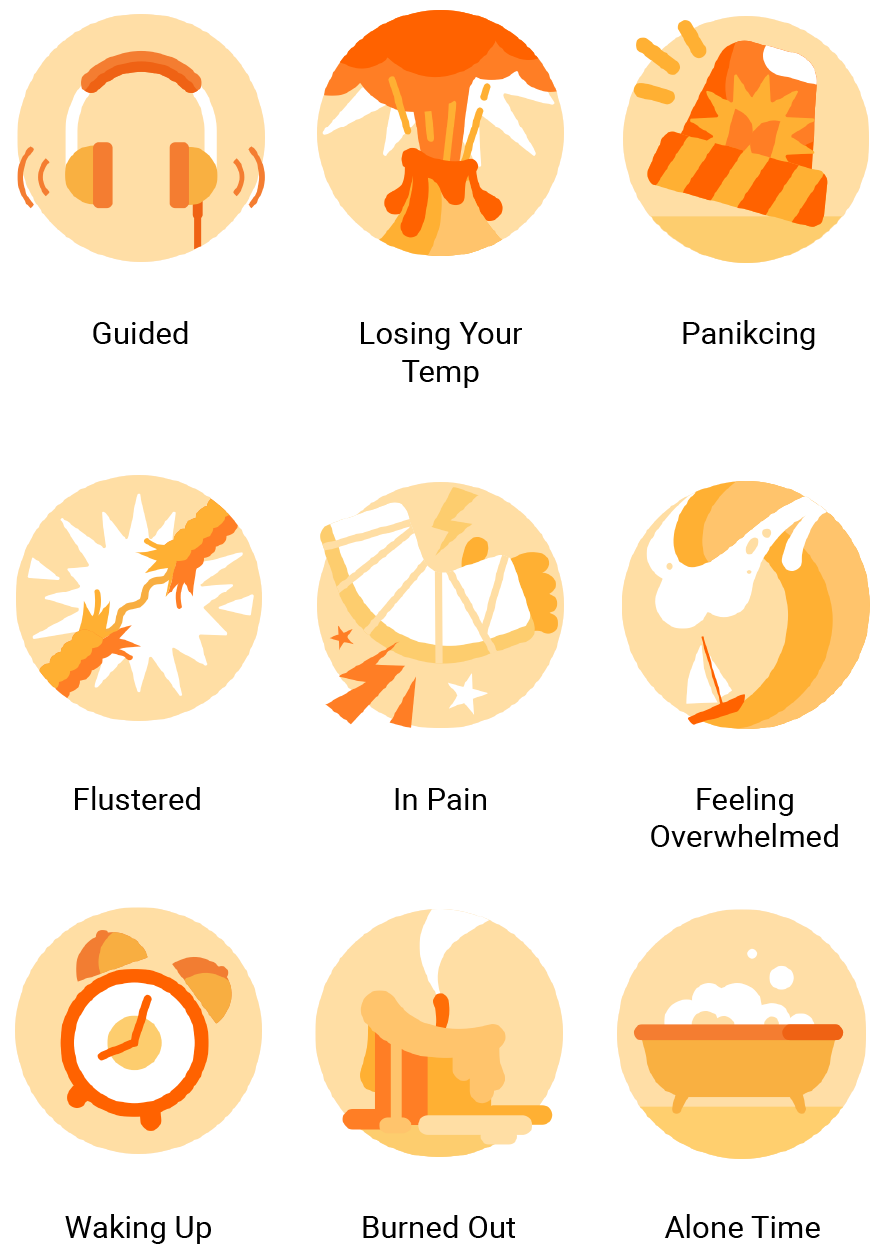
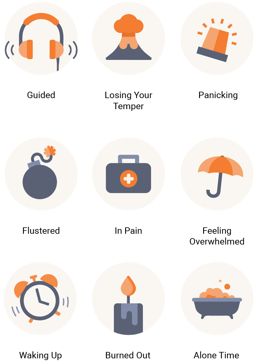
While viewing the mobile app icons using Colorblinding, a Google Chrome colorblind simulator extension, our team realized that the icons were difficult to distinguish. In order to enable colorblind users to navigate the app more efficiently, I redesigned the icons to create more contrast.
BEFORE
AFTER
REFINE & DELIVER
Accessibility Validation
After redesigning the app, our team conducted a detailed compliance check to ensure it adhered to relevant accessibility requirements. In addition, we used Colorblinding to see how different types of colorblind users would see the app.
